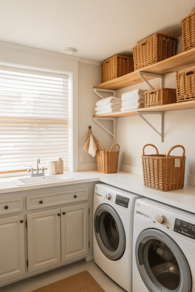
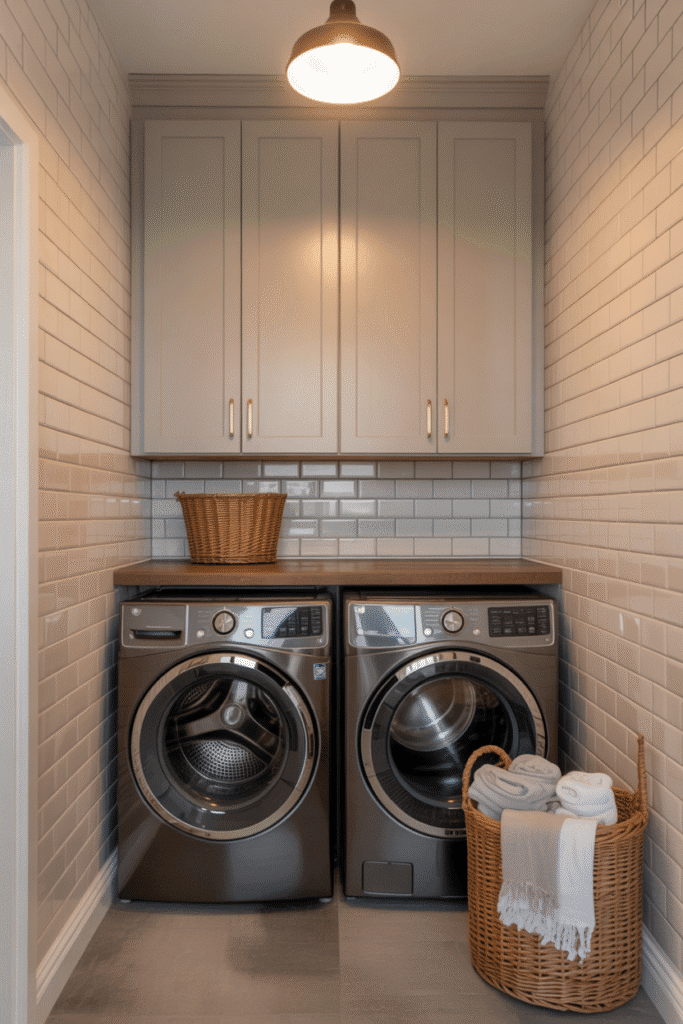
Let’s be honest — laundry rooms don’t always get the attention they deserve. They’re small, often windowless, and usually tucked away where no one sees them. But here’s the thing: just because your laundry room is small doesn’t mean it can’t be stylish.
One of the quickest (and most budget-friendly) ways to elevate a small laundry room is by painting the cabinets. Color can completely transform the feel of the space — making it brighter, cleaner, more modern, or even just more fun to be in. And when square footage is limited, every design decision matters.
Whether you’re planning a full refresh or just want to touch up your existing cabinets, here are 18 of the best cabinet paint colors for small laundry rooms that pack style, personality, and practical design punch.
Soft White: Clean and Timeless
White is a classic for a reason. It brightens tight spaces and reflects light beautifully — perfect for small, enclosed laundry rooms.
Why It Works: Creates a crisp, clean vibe that makes the room feel more open and organized.
Warm Greige: Neutral But Not Boring
A blend of gray and beige, greige offers a soft, welcoming alternative to plain white.
Why It Works: Adds warmth and depth while staying light enough to keep the space airy.
Sky Blue: Light and Uplifting
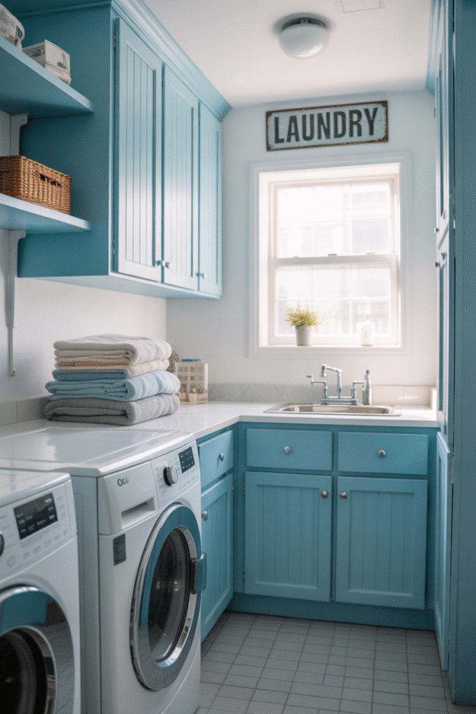
This pale blue shade brings calm and clarity to even the busiest laundry days.
Why It Works: Evokes a fresh, open-sky feeling — especially nice if you don’t have a window.
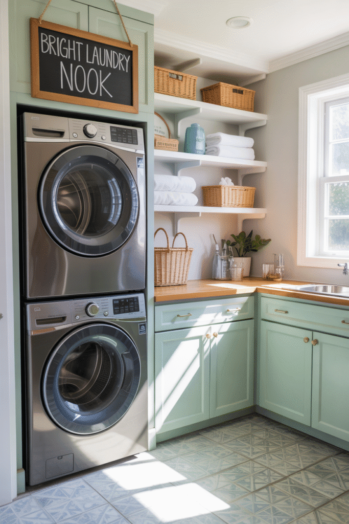
Dusty Sage Green: Soft and Earthy
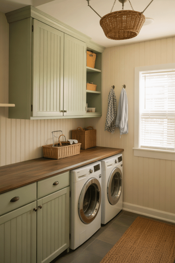
Muted sage green adds a touch of nature without overwhelming the space.
Why It Works: It’s soothing, timeless, and pairs beautifully with both white and wood accents.
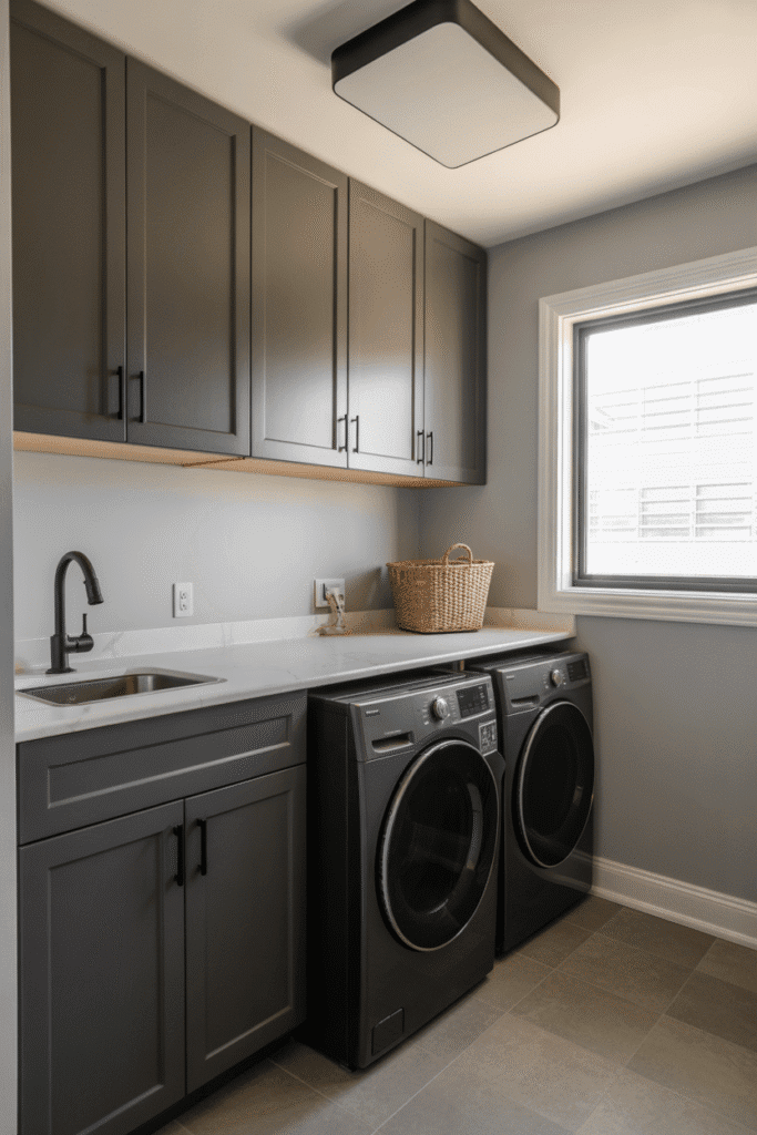
Charcoal Gray: Bold but Balanced
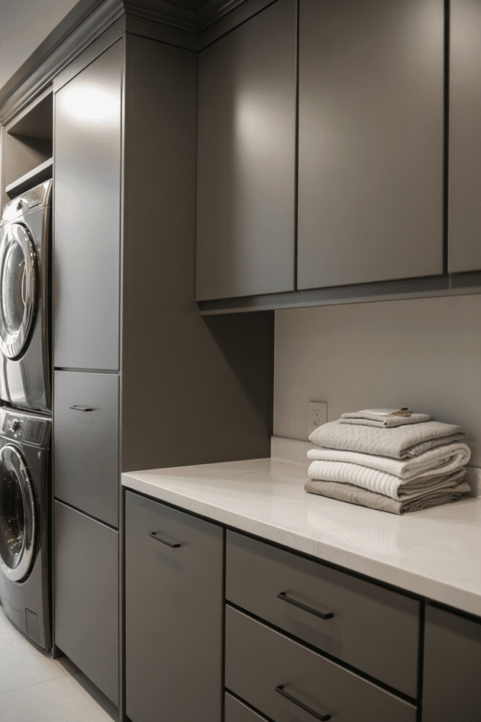
If you want contrast without full-on black, charcoal gray adds moody sophistication in a small space.
Why It Works: It anchors the room and hides fingerprints better than lighter shades.
Pale Yellow: Cheerful and Inviting
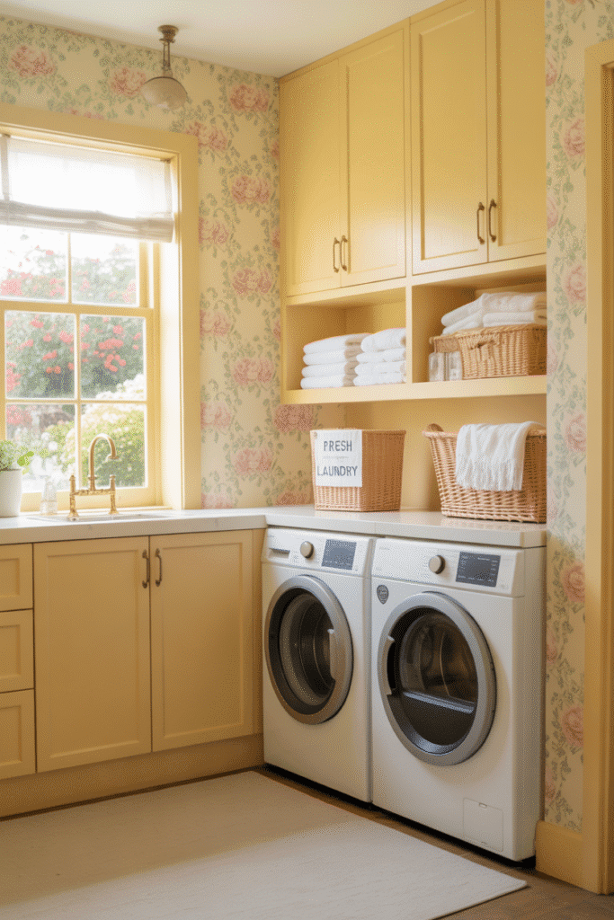
Add a little sunshine with a creamy or buttery yellow. It’s soft, sweet, and instantly brightens the room.
Why It Works: Yellow reflects light while adding a cheerful, cottage-style charm.
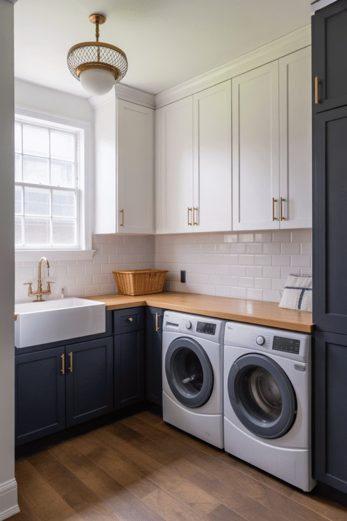
Navy Blue: Classic and Rich
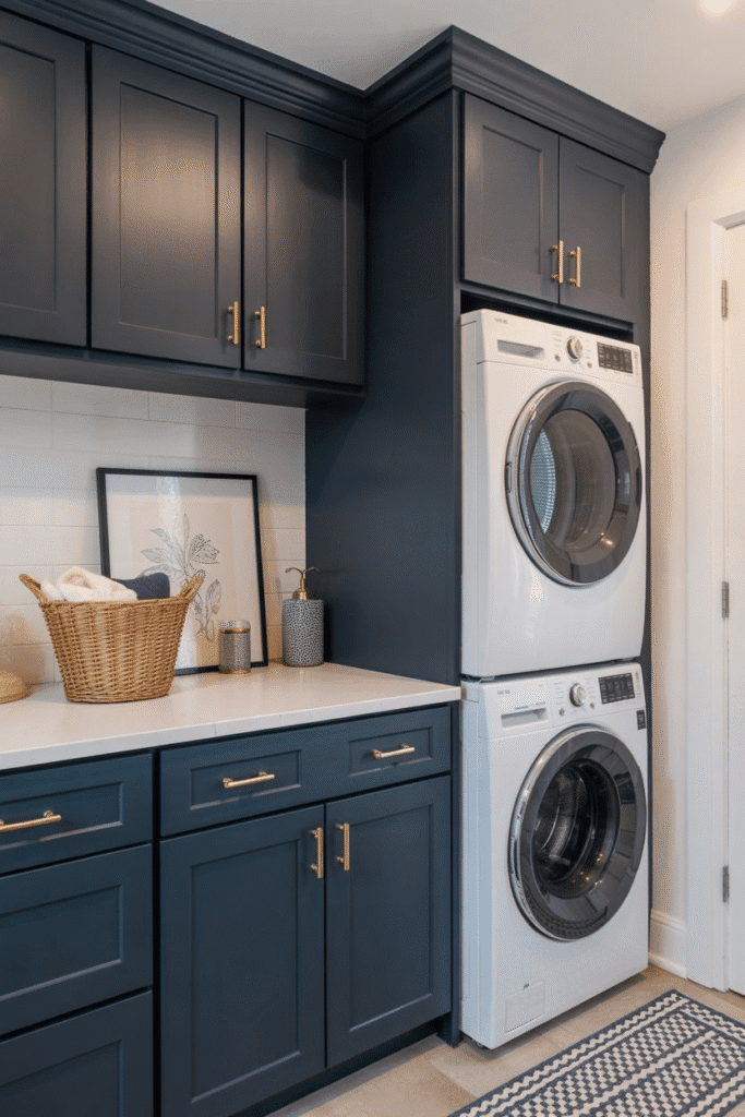
Navy brings depth and drama but still feels timeless — especially when paired with gold or brass hardware.
Why It Works: Perfect for a pop of color in a neutral space without going too dark.
Mint Green: Light and Breezy
Fresh and fun, mint green adds just enough personality without being too loud.
Why It Works: Looks amazing with white walls and natural wood shelving.
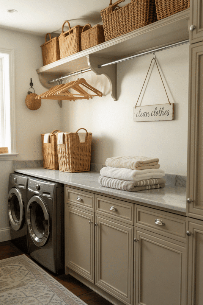
Light Taupe: Understated Elegance
Not quite gray, not quite beige — taupe is a great mid-tone neutral that feels cozy and refined.
Why It Works: Keeps the space grounded while still feeling airy.
Blush Pink: Soft and Unexpected
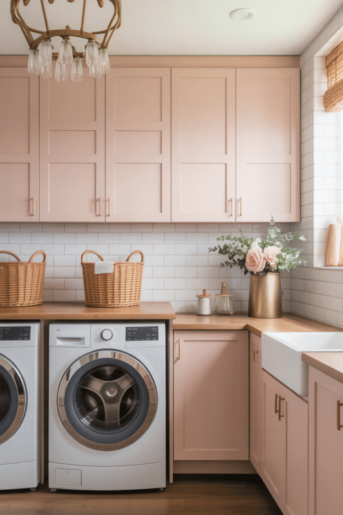
Don’t overlook pink! A soft blush brings subtle warmth and modern femininity.
Why It Works: Adds color without overwhelming the space — especially in a white or gray room.
Deep Green: Cozy and Organic
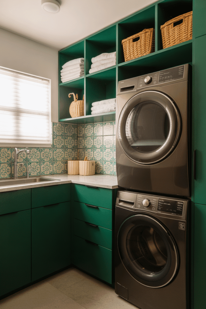
Think hunter green or forest tones — rich, moody, and totally on-trend.
Why It Works: Works great on lower cabinets or paired with light counters and backsplashes.
Powder Blue: Serene and Classic
A bit deeper than sky blue, powder blue feels elegant yet playful — perfect for traditional or farmhouse styles.
Why It Works: Adds color without taking over the whole room.
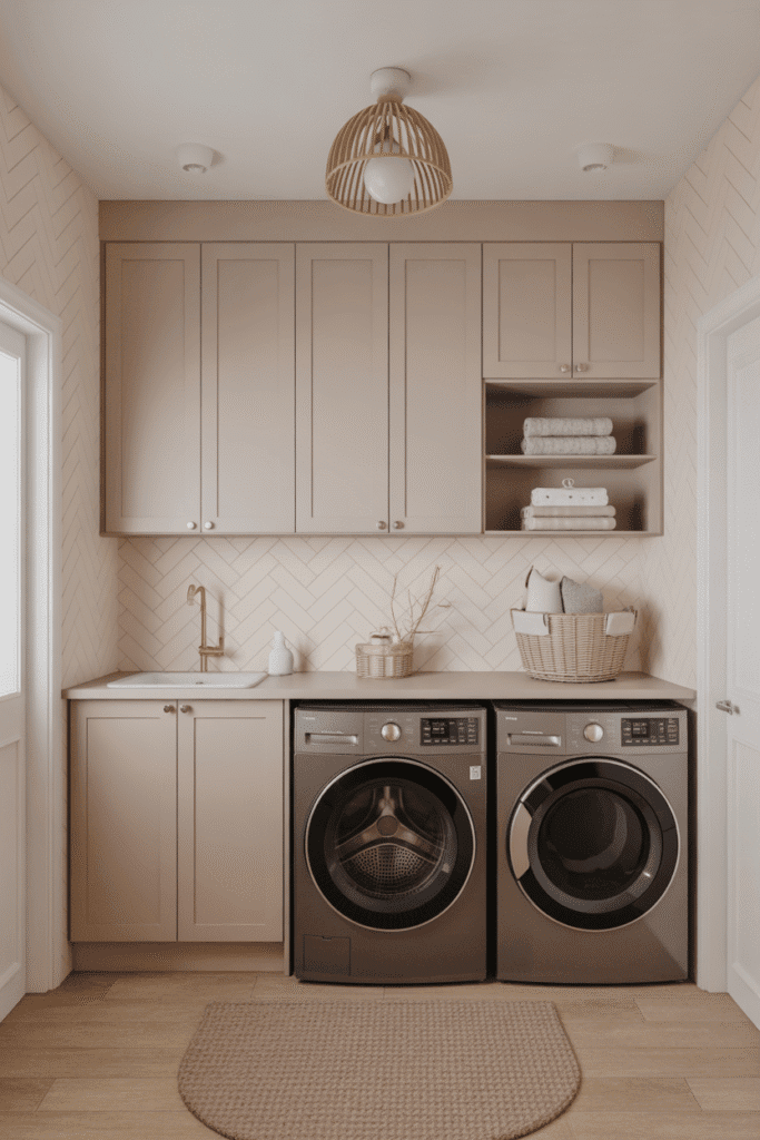
Creamy Almond: Warm and Subtle
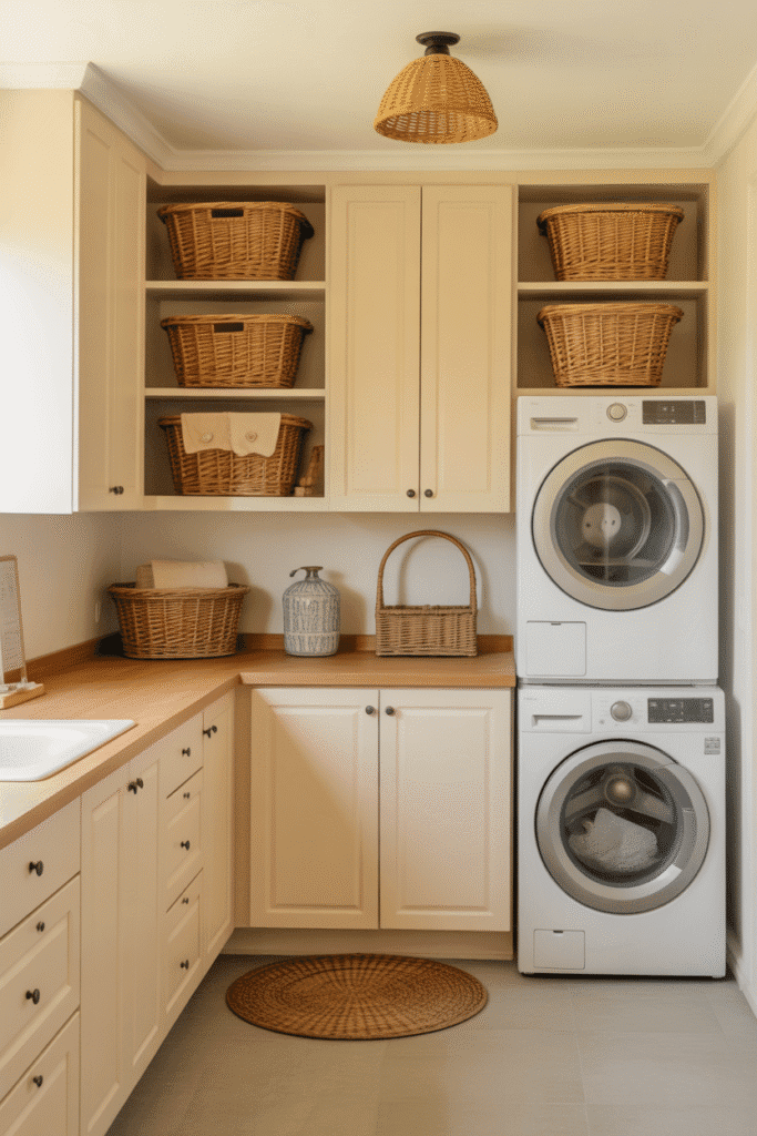
For those who find white too stark, almond tones offer a warm, inviting neutral alternative.
Why It Works: Blends easily with both cool and warm tones in decor and flooring.
Soft Black: Modern and Minimalist
Yes, black can work in a small laundry room — especially when the finish is soft or matte.
Why It Works: Creates a sophisticated contrast, especially when paired with white walls or tile.
Terracotta: Earthy and Inviting
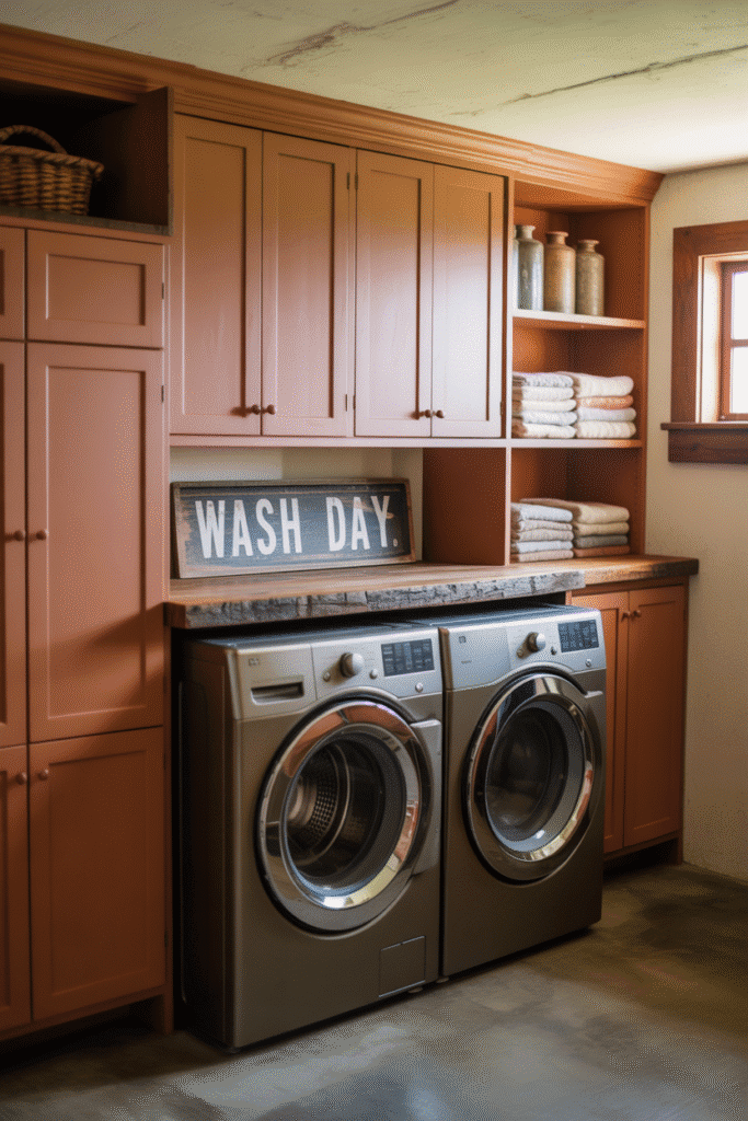
Inspired by natural clay tones, terracotta warms up any room with character and depth.
Why It Works: Adds a rustic, Mediterranean vibe that’s both cozy and unexpected.
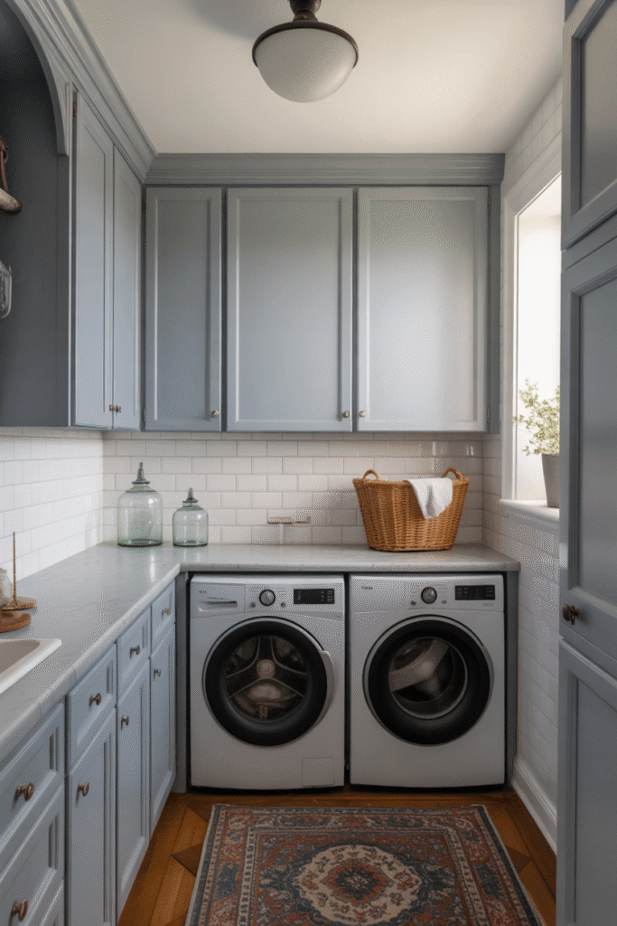
French Gray: Cool and Classic
French gray is a blue-gray tone that feels elegant, calming, and never boring.
Why It Works: Great with marble countertops or brushed nickel fixtures.
Crisp Teal: Bold and Bright
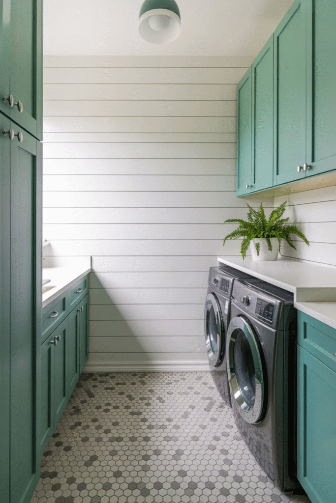
Teal adds a bit more saturation while still feeling fresh and energizing.
Why It Works: Works beautifully as a statement color against white walls or light wood flooring.
Two-Tone Cabinets
Can’t decide on one color? Try a two-tone combo — like white uppers and navy lowers — to create visual interest without overwhelming the room.
Why It Works: Adds dimension and balance, especially in small laundry layouts.
Big Style in Small Spaces
Don’t underestimate the power of a paintbrush! The right cabinet paint color for your small laundry room can completely transform how it looks and feels — without a full remodel. Whether you go light and bright, moody and modern, or somewhere in between, color sets the tone for how you experience your space every single day.
So grab a sample, test it out in different light, and choose the shade that makes your laundry room feel like less of a chore and more of a retreat.